7 Common Website Mistakes That Can Make Visitors Leave
Creating a website is easier than ever. You can choose a template, add your content, connect a domain, and publish a website within a relatively short time.
But getting a website online is only the beginning.
A website can look attractive and still perform poorly if visitors can't quickly understand what it offers, find what they're looking for, or use it comfortably on their phones.
Sometimes the problem isn't something complicated. A few small mistakes can make the entire experience frustrating.
Here are seven common website mistakes worth checking.
1. Making Visitors Guess What the Website Is About
When someone opens your homepage, they shouldn't have to spend several seconds trying to figure out what they're looking at.
A common mistake is using a headline that sounds impressive but doesn't actually explain anything.
For example:
> “Building Tomorrow's Digital Future.”
It sounds professional, but what does the company actually do?
A clearer headline might be:
> “Affordable Websites for Small Businesses.”
The second example immediately tells the visitor what is being offered.
Your homepage should make three things reasonably clear:
What you offer
Who it's for
What visitors can do next
Clarity is usually more valuable than clever wording.
2. Designing Only for Computers
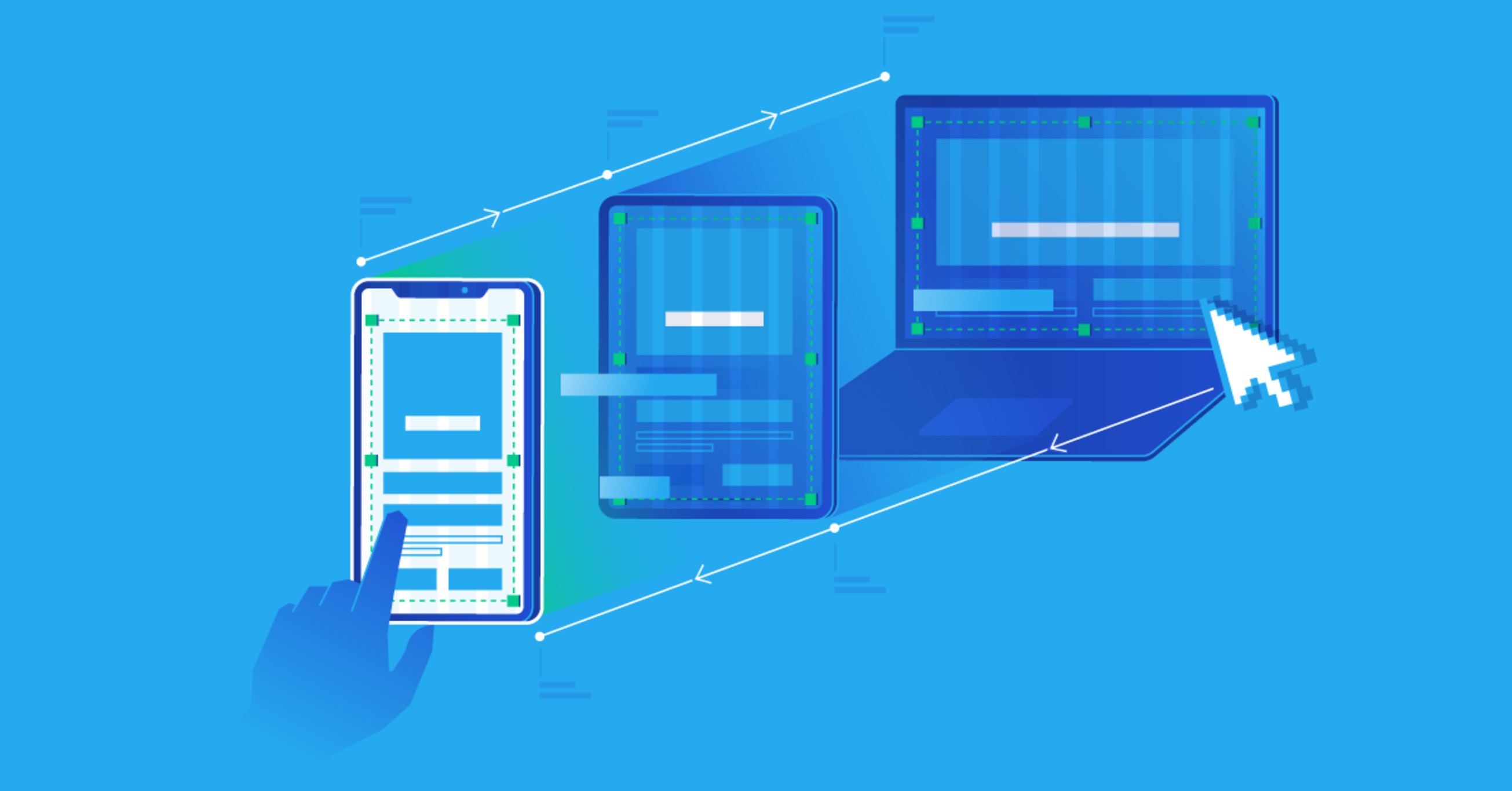
A website might look perfect on a laptop and terrible on a smartphone.
That's a serious problem.
People use different screen sizes and devices to access the internet, so your website needs to adapt accordingly.
Check your website on a phone and look at:
Text size
Images
Buttons
Navigation menus
Forms
Tables
Page spacing
Horizontal scrolling
If visitors have to zoom in just to read your content, something needs to be fixed.
Don't assume your website builder has solved everything automatically.
Test it yourself.
3. Too Many Things Competing for Attention
Some websites try to make every element stand out.
There are large headings, animated backgrounds, multiple colors, pop-ups, videos, banners, notification boxes, and several buttons all competing for attention.
The result can be overwhelming.
A visitor should be able to identify the most important part of a page without having to study it.
This is where visual hierarchy becomes important.
Your most important information should generally receive the strongest visual emphasis.
Secondary information can be quieter.
You don't need every element to shout.
4. Slow Page Loading
People are not particularly patient with slow websites.
A visitor might leave before the page finishes loading, especially when they're using a mobile connection.
Large images are one common cause of slow pages.
Other possible causes include:
Excessive scripts
Too many third-party services
Poorly optimized code
Large videos
Unnecessary plugins
Slow hosting
You don't need to remove every image or animation.
Instead, ask whether each element is actually necessary.
Compress images where appropriate, avoid unnecessary scripts, and test your website's performance regularly.
5. Difficult Navigation
Imagine visiting a website and wanting to find its contact page.
You look at the navigation menu.
Nothing says “Contact.”
You click around.
Still nothing.
Eventually, you leave.
Navigation should help visitors understand where they are and where they can go next.
For many websites, a simple navigation structure is enough:
Home | About | Services | Blog | Contact
The exact structure depends on the website, but the principle is the same:
Don't make visitors hunt for important information.
6. Ignoring Broken Links and Buttons
A website can look completely professional while quietly containing links that don't work.
This is especially common when pages have been moved, deleted, or renamed.
Test your important links regularly.
Check:
Navigation links
Contact buttons
Forms
Social media links
Download buttons
Internal article links
If a visitor clicks something and nothing happens, their confidence in the entire website can drop.
Broken links can also create a poor experience for search-engine users.
7. Writing for Search Engines Instead of Humans
Search engine optimization is important.
But there's a difference between optimizing content and writing content that sounds like it was created entirely for search engines.
For example, repeatedly forcing the same keyword into every paragraph can make an article difficult to read.
Instead, write naturally.
Answer the reader's question.
Use clear headings.
Explain the subject properly.
Add useful examples.
Then make reasonable SEO improvements without destroying the quality of the writing.
Your first audience should be the person reading the article.
Don't Forget the Small Details
Some of the most noticeable website problems are surprisingly small.
A spelling mistake in a headline.
A button that says “Learn More” but doesn't work.
A contact form that never sends the message.
An image that appears stretched.
A footer containing an outdated year.
A page that still contains placeholder text from the template.
These details can make a website feel unfinished.
Before launching a website, go through it as though you're a first-time visitor.
Don't just ask:
> “Does it look good?”
Ask:
> “Can I actually use it easily?”
That's a much better test.
A Simple Website Check
Before publishing a new website, take a few minutes to check these areas:
Homepage
Can someone understand what the website does immediately?
Mobile
Does everything work comfortably on a phone?
Navigation
Can visitors find important pages easily?
Speed
Do the main pages load reasonably quickly?
Content
Is the information useful and easy to understand?
Links
Do important links and buttons work?
Contact
Can visitors easily contact the business or website owner?
Trust
Does the website provide appropriate information about who operates it?
Legal pages
Where relevant, are privacy and other necessary policies clearly available?
Final Thoughts
A professional website isn't necessarily the website with the most impressive animation or the most complicated design.
Often, it's the website that simply works.
Visitors can understand it.
They can find what they need.
Pages load properly.
Buttons work.
The content is useful.
And the website feels trustworthy.
If you're building a website today, don't spend all your time thinking about how to make it look impressive.
Spend some time asking a more important question:
“What would make this easier for my visitor?”
That mindset can improve almost every part of a website.
This article is part of Alvonbot.com's Technology, Web Development and Digital Skills series.

Leave a comment
Your email address will not be published. Required fields are marked *