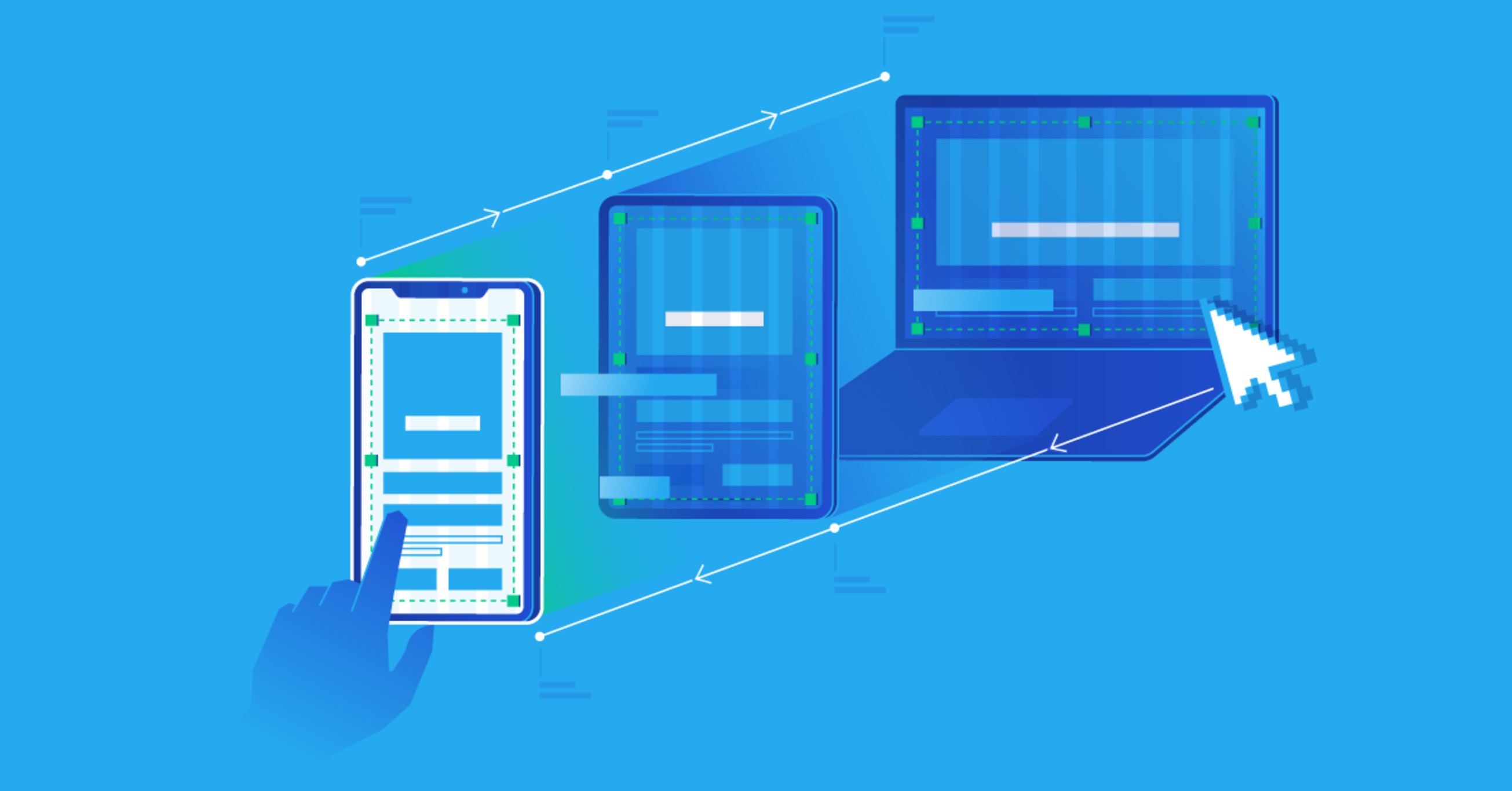
In 2026, more than half of all website traffic comes from phones and tablets. If your website only looks good on a desktop computer, you’re already losing visitors. A responsive website automatically adjusts its layout to look good on any screen size — from large monitors to small phones.
The good news? Making a website responsive is not as difficult as many beginners think. You don’t need complicated frameworks to get started. With plain HTML and CSS, you can create sites that work beautifully on every device.
This guide will show you exactly how to do it, step by step.
### What Does “Responsive” Actually Mean?
A responsive website:
- Looks good on large desktop screens
- Still looks good on tablets
- Remains readable and usable on mobile phones
- Doesn’t force users to zoom or scroll horizontally
- Keeps buttons and links easy to tap with a finger
The goal is simple: one website that works everywhere.
### The Three Core Ingredients of Responsive Design
There are three main techniques you need to understand:
1. **Fluid Layouts** – Using percentages and flexible units instead of fixed pixels
2. **Flexible Images** – Making images shrink or grow with the screen
3. **Media Queries** – Writing CSS rules that only apply at certain screen sizes
Let’s break each one down.
### 1. Start with a Mobile-First Approach
In the past, people designed for desktop first and then tried to shrink everything for mobile. Today, the smarter way is **mobile-first**.
This means:
- Design the mobile version first
- Then add extra styles for larger screens
Why? Because mobile designs are simpler. It’s easier to add complexity later than to remove it.
In practice, you write your normal CSS for small screens, then use media queries to adjust things for bigger screens.
### 2. Use the Viewport Meta Tag
This is the most important one-line addition for mobile devices. Without it, phones will try to show the desktop version of your site and shrink it down, making everything tiny.
Add this inside the `<head>` of every HTML page:
```html
<meta name="viewport" content="width=device-width, initial-scale=1.0">
```
That’s it. This single line tells the browser to match the screen width of the device.
### 3. Make Layouts Flexible with Flexbox and Grid
Fixed widths (like `width: 900px`) break on mobile. Instead, use flexible methods:
**Flexbox** is perfect for most common layouts (navigation bars, card rows, centering content).
Example of a simple responsive navigation:
```css
nav {
display: flex;
flex-wrap: wrap;
justify-content: center;
gap: 1rem;
}
```
**CSS Grid** is excellent when you need more control over rows and columns.
Example:
```css
.container {
display: grid;
grid-template-columns: 1fr;
gap: 1.5rem;
}
/* On larger screens, switch to two columns */
@media (min-width: 768px) {
.container {
grid-template-columns: 1fr 1fr;
}
}
```
### 4. Make Images Responsive
Images are one of the most common causes of horizontal scrolling on mobile.
Add this simple CSS rule:
```css
img {
max-width: 100%;
height: auto;
display: block;
}
```
This tells images: “Never be wider than your container, and keep your original proportions.”
For better performance, you can also use the HTML `srcset` attribute later, but the CSS above is enough for beginners.
### 5. Master Media Queries
Media queries let you apply different styles depending on the screen size.
Basic structure:
```css
/* Styles for mobile (default) */
@media (min-width: 768px) {
/* Styles for tablets and up */
}
@media (min-width: 1024px) {
/* Styles for desktops */
}
```
**Common breakpoints** that work well in 2026:
| Device Type | Common Breakpoint |
|-------------------|-------------------|
| Mobile | Default (0px+) |
| Tablet | 768px |
| Small Desktop | 1024px |
| Large Desktop | 1200px or 1440px |
You don’t need dozens of breakpoints. Start with two or three.
### Practical Example: Making a Simple Page Responsive
Imagine you have a page with a heading, some text, and three feature cards.
**Mobile styles (default):**
- Cards stack on top of each other
- Text is readable
- Plenty of spacing
**Tablet and up:**
- Cards sit side by side in a row
Here’s how the CSS could look:
```css
.cards {
display: flex;
flex-direction: column;
gap: 1.5rem;
}
.card {
background: white;
padding: 1.5rem;
border-radius: 8px;
box-shadow: 0 2px 8px rgba(0,0,0,0.1);
}
/* From tablet size and above */
@media (min-width: 768px) {
.cards {
flex-direction: row;
}
}
```
That’s the core idea. Start simple and build from there.
### Useful Responsive Units
Instead of only using `px`, start mixing in modern units:
- `%` – Relative to the parent element
- `em` / `rem` – Relative to font size (great for spacing and typography)
- `vw` / `vh` – Relative to the viewport width/height (use carefully)
- `fr` – Used in CSS Grid for flexible columns
For font sizes, many developers now use `rem` so text scales nicely.
### Testing Your Responsive Design
Never trust only resizing your browser window. Real testing matters.
Free and easy ways to test:
- Chrome DevTools (press F12 → toggle device toolbar)
- Firefox Responsive Design Mode
- Real phones and tablets (the best test)
- Free tools like Responsively App or BrowserStack (limited free plan)
Check these things on mobile:
- Is the text easy to read without zooming?
- Are buttons big enough to tap with a finger?
- Is there any horizontal scrolling?
- Does the layout feel balanced?
### Common Beginner Mistakes
- Forgetting the viewport meta tag
- Using fixed pixel widths everywhere
- Making touch targets too small (buttons should be at least 44×44 pixels)
- Too many breakpoints too early
- Ignoring landscape mode on phones
- Not testing on real devices
### Quick Responsive Checklist
Before calling a page “responsive,” check:
- [ ] Viewport meta tag is present
- [ ] Images scale properly
- [ ] Layout uses Flexbox or Grid
- [ ] Media queries adjust the design at key sizes
- [ ] Text remains readable on small screens
- [ ] No horizontal scrolling
- [ ] Buttons and links are easy to tap
### What to Learn Next
Once you’re comfortable with the basics above, you can explore:
- Container queries (a newer and more powerful approach)
- Modern CSS features like `clamp()` for fluid typography
- CSS frameworks (Tailwind CSS is very popular in 2026)
- Advanced layout patterns
But you don’t need those to create good responsive websites. Master the fundamentals first.
### Final Thoughts
Responsive design is no longer optional — it’s a basic requirement. The good news is that the tools we have today (especially Flexbox and Grid) make it much easier than it used to be.
Start with one of your existing pages. Add the viewport tag, make the images flexible, and introduce one or two media queries. You’ll see immediate improvement.
Every professional website you admire is responsive. Now you know the core techniques they use. Practice them on real projects and your skills will grow quickly.
You now have everything you need to make your websites look good on every device.

Leave a comment
Your email address will not be published. Required fields are marked *